|
|||
|
Last week, I had the first installment of a three-part wish list, with four wishes for Innoventions Plaza at Epcot. Today, I have part two with four more. These aren’t billion dollar wishes. They’re more modest.
|
|||
|
|
|||
|
By the late 1970s, planning for EPCOT, Walt Disney’s grandest vision, was seriously underway—sort of. It would no longer be Walt’s actual city where innovative companies would showcase ways to improve how people live. With Walt gone since 1966, the executives considered that not to be doable. Epcot Center would be the next best thing—a theme park for park guests, not a city for residents and visitors. There would still be a showcase for innovative companies—Future World. |
|||
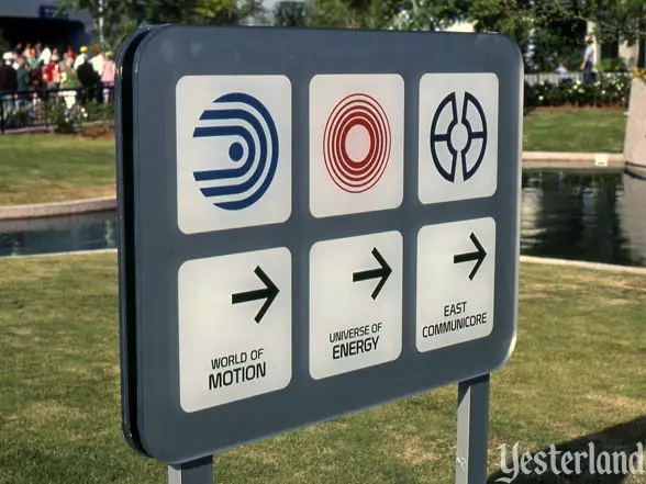
Photo by Werner Weiss, 1983 |
|||
|
The park opened October 1, 1982 with CommuniCore East, CommuniCore West, and five large single-sponsor pavilions:
During the park’s first decade, they would be joined by three more:
All the original sponsors have departed, except for GM (as Chevrolet). In some cases, Disney found new sponsors. Future World has continued to evolve, especially with major updates in the mid-1990s. Horizons is gone. The former Wonders of Life is an event center. Mission: Space, presented by Compaq (now Hewlett-Packard), opened in 2003. As of 2016, only Spaceship Earth, Test Track, and Mission: Space still have sponsor names on their main signs. Future World has some bright spots, but other spots need attention. Let’s look at four of them. |
|||
|
|
|||
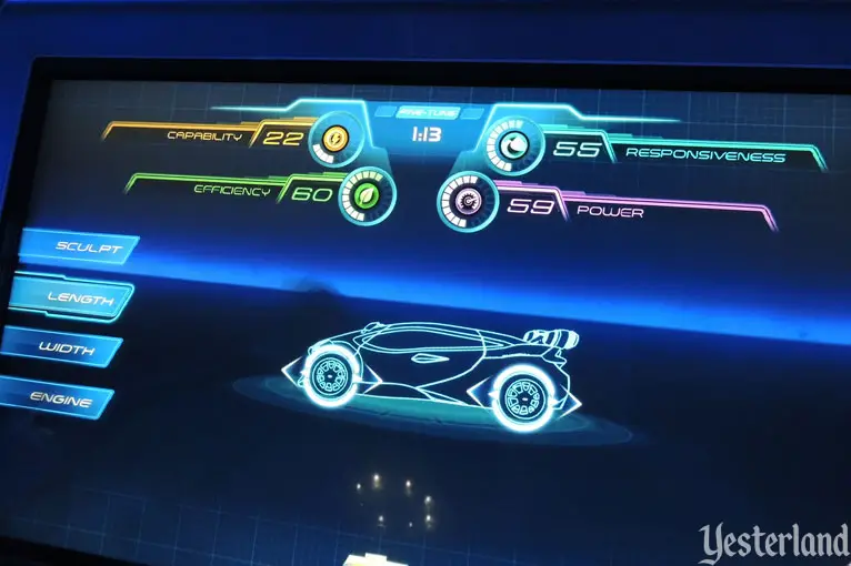
Photo by Werner Weiss, 2015 |
|||
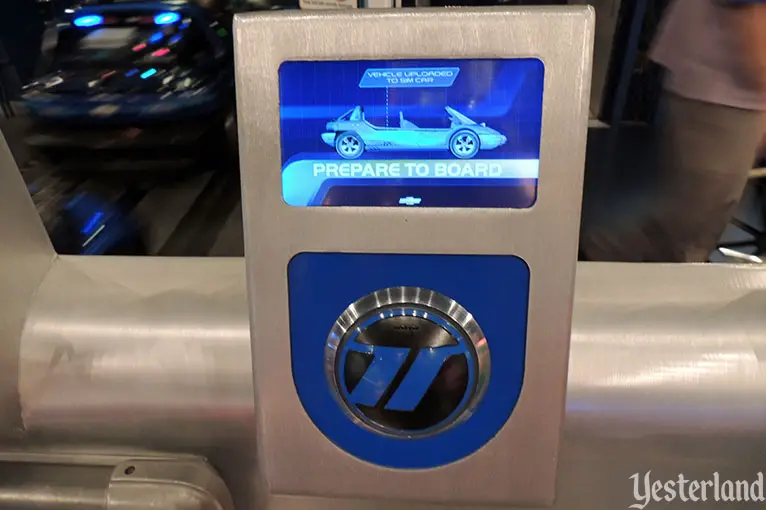
Photo by Werner Weiss, 2015 |
|||
|
Wish 5. Make the story for Test Track work, or replace it. |
|||
|
The original version of Test Track told a straightforward story of how GM tests cars. The story was easily understandable. The highlight was a “test vehicle” ride that included a high-speed banked track. The updated version of Test Track, which opened in December 2012, is about designing cars with the right balance of “Capability, Efficiency, Responsiveness, and Power.” Guests design their own cars on touch screens, with their designs linked to their MagicBands. Before boarding a “Sim Car” (former ride vehicle painted blue), guests touch their MagicBands to an RF reader. During the ride, they can see how well their design succeeds on the track and in comparison to the other guests in the car on four displays along the way, one for each design factor. After the ride, guests can see their total score, and they can use their car designs for interactive experiences. And each time they ride, guests can try a new design, so it’s never the same attraction twice. At least that’s how it’s supposed to work. In reality, the connection between the design terminal and the shared “Sim Car” is too abstract. For most guests, the design terminals have as much relationship to the ride as the interactive queue elements at Haunted Mansion have to affecting that ride. Even the rare guest who understands how the new Test Track is supposed to work will often encounter problems such as not being able to get the RF reader to capture the design off the MagicBand, being in a car where nobody else even tries to load their design, and having several broken displays along the track that fail to display design scores. Most guests ignore the interactive activities after the ride. The ride itself is very popular because of the high-speed banked track. It’s a shame that the attraction fails as a cohesive experience. |
|||
|
|
|||
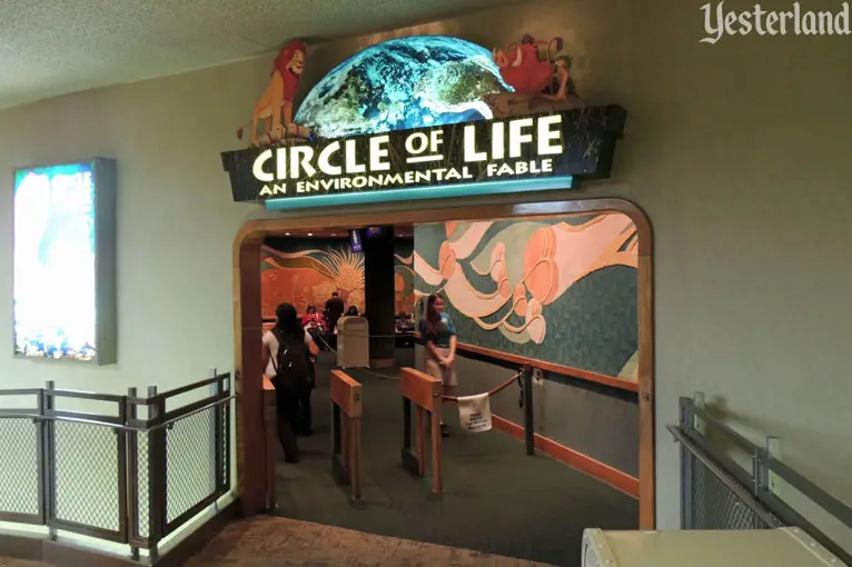
Photo by Werner Weiss, 2015 |
|||
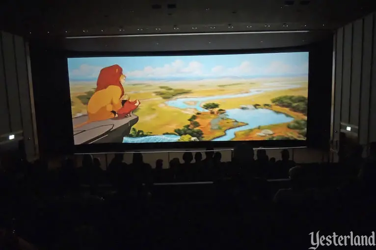
Photo by Werner Weiss, 2015 |
|||
|
Wish 6. Replace The Circle of Life at The Land. |
|||
|
The Land has always been a pavilion with several attraction spaces under one roof. One of them is a movie theater. For a dozen years, the movie was Symbiosis, a serious—some would say too serious for a theme park—look at environmental issues. In 1995, a new movie, Circle of Life: An Environmental Fable, featured popular characters from The Lion King with reused footage from Symbiosis. The environmental theme was similar, but it was more entertaining and kid-friendly. Twenty years later, it was still the same movie. Really? Disney could not come up with a new movie that fits the theme of The Land in a period of twenty years? A sizzle reel from the Disneynature movie series might work well. Something entirely new would be even better. And maybe they could change out the movie every two or three years from now on. Movies, by their very nature, are not as repeatable as rides. But movies are much easier to replace—especially when the movie doesn’t involve a motion base, animatronics, or other in-theater special effects. There is an Internet rumor that a new movie is coming in 2016. Let’s see if that happens. If so, one wish in this article will have been granted. |
|||
|
|
|||
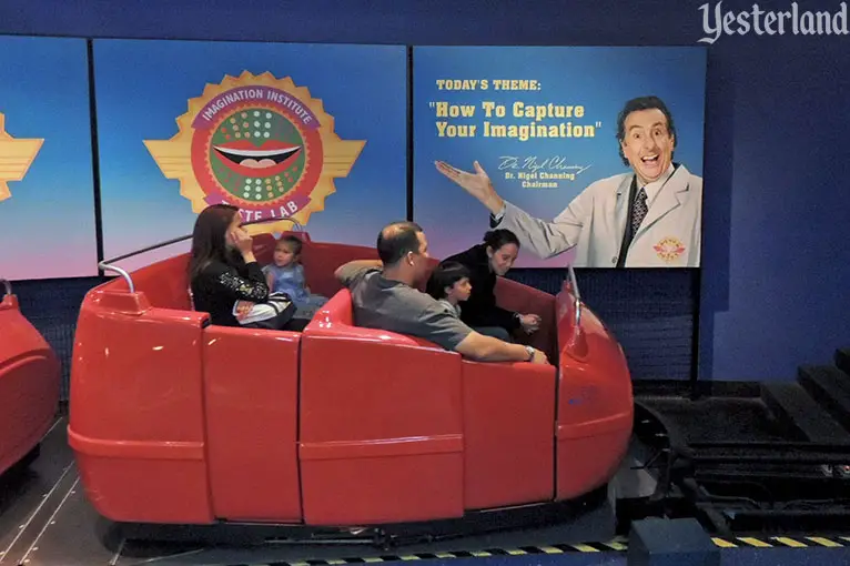
Photo by Werner Weiss, 2015 |
|||
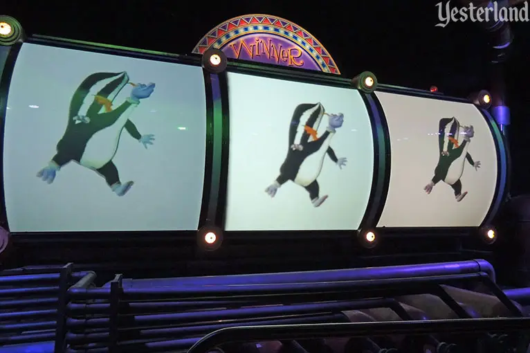
Photo by Werner Weiss, 2015 |
|||
|
Wish 7. Imagine a new ride at the Imagination! pavilion. |
|||
|
Of all the regrettable decisions ever made by the executives who run Disney’s parks, tearing out Journey Into Imagination in 1998 might be the most regrettable. The original dark ride was magical—to use a word that’s overused by Disney. Dreamfinder and Figment, the memorable characters developed for the ride, took guests through large show scenes featuring art, literature, performing arts, and science. The characters, music, and design all worked together to make a delightful ride celebrating creativity. But Disney and the attraction’s sponsor, Kodak, decided that it was time for something new. The replacement in 1999 was called Journey Into Your Imagination. This time, the ride began with guests being given an “imagination scan” that revealed, “there’s not much going on upstairs imagination-wise.” After that insult, it didn’t get much better. Dreamfinder was gone. Figment was included just enough so that Epcot could continue to sell plush and other items with the popular purple dragon. This version of the ride only lasted two years. In 2002, a third version, Journey into Imagination with Figment, fixed the worst elements of the second version. No insulting the guests. A bigger role for Figment. No longer a scene that terrified young children with the sound of a train approaching in total darkness. But the ride was still a far cry from the original. As of 2016, the third version is still running. Kodak is out of the picture, and no other company has stepped in to take its place. Although it’s a FastPass+ attraction, there’s seldom any wait in the standby line. The references to Honey, I Shrunk the Kids and its theme park derivative, Honey, I Shrunk the Audience, no longer have any relevance. It’s time for something completely new. Imagination is still a good theme. The ride system is fine. The ride is not. |
|||
|
|
|||
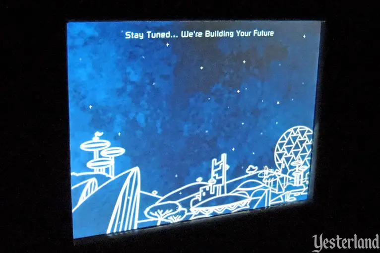
Photo by Werner Weiss, 2015 |
|||
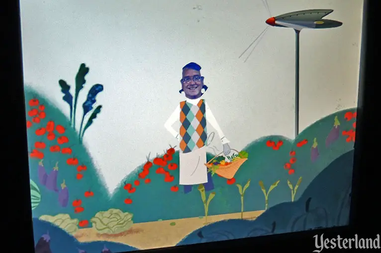
Photo by Werner Weiss, 2015 |
|||
|
Wish 8. Fix the descent in Spaceship Earth. |
|||
|
Spaceship Earth is an opening day attraction inside the 180-foot geosphere at the entrance to Epcot. It’s gone through four major updates, each with a different narrator. All four versions have relied on the show scenes from the original 1982 version as the ride vehicles slowly ascend within the sphere. The impressive tableaus have been tweaked, and the narration has been rewritten, but the current scenes would still be familiar to opening day guests. The theme of the first three versions was communications, reflecting sponsor AT&T (originally branded as the Bell System). The theme since 2008 has been innovation, reflecting current sponsor Siemens. So, as the ride vehicles approach the highest elevation, the current version features mainframe computers and the birth of the consumer desktop computer in a garage, not AT&T network operations or international video calling. Next, all versions have shown planet Earth, as viewed from space, at the top of the sphere’s interior. It’s an impressive end to the ride—except that it isn’t the end. The ride vehicles still need to descend back to the bottom of the sphere. And that’s where the problem begins. While the ascent goes through rooms large enough for impressive show scenes, the descent uses a tight tunnel. It takes a long time because the vehicles must move at the same slow speed as on the ascent. In the first two versions, closing narration, music, and limited visuals (primarily lights) filled the time before reaching the unloading turntable. For the third version, the Imagineers squeezed show scenes into whatever crevices they could find along the descent route. By necessity, the scenes were flat and unimpressive compared to the show scenes on the ascent. For the current version (from 2008), the Imagineers did something completely different. Instead of trying to use the limited space outside the ride vehicle, they added touchscreens to every row. The descent became an interactive activity. A camera takes a photo of each guest’s face at the beginning of the ride. Those photos become part of a personalized animated video about the future, with scenes based on how guests answer questions on their touchscreens. Sometimes it works. Too often it doesn’t. How hard is it to isolate heads on digital images, especially when the heads are against a solid blue background? It’s unclear whether Disney uses face recognition technology, or human Cast Members, or a combination of the two. It shouldn’t be that hard. Yet it’s common to have a quarter of a head missing, or giant chunks of blue background attached to the top or side of a head, or weird bites taken out of a head (like the Apple logo), or even to be completely decapitated. And then there are the cases when one or both guests in a row end up with generic, gender-neutral cartoon heads instead of their own heads. Make it work the way it’s supposed to, please. As wishes go, this one is especially modest. But Disney has had since 2008 to get this right, and it’s still broken. |
|||
|
|
Click here to post comments at MiceChat about this article.
© 2016 Werner Weiss — Disclaimers, Copyright, and Trademarks Updated February 19, 2016. |
||
