|
|
Disneyland Sign LEGO Edition |
||
|
|
|||
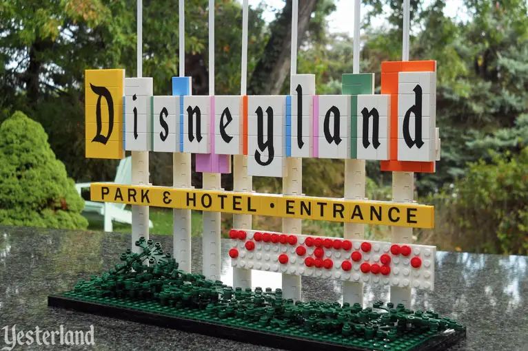
Photo by Andy Baird, 2016 |
|||
|
Last year, Yesterland reader Andy Baird designed and built a LEGO version of the House of the Future. Earlier this year, he created a LEGO version of the PeopleMover. Now Andy is back with another LEGO model. It’s his representation of the iconic Disneyland marquee sign on Harbor Blvd.
|
|||
|
|
|||
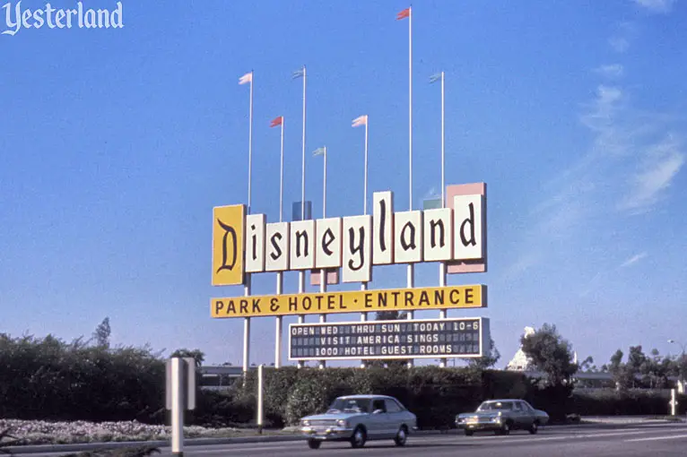
Photo by Werner Weiss, 1974 |
|||
|
Although Disneyland opened in 1955, the park’s first landmark sign appeared in 1958. The two-sided sign faced north and south on Harbor Blvd. Colorful rigid pennants “flew” from flagpoles of various heights that soared above individual letters. Taking a cue from movie theaters, the sign originally included white marquees with changeable letters. For more the 30 years, the sign welcomed motoring guests to Disneyland. It was modified several times as tastes, technology, and marketing changed. For example, the photo above shows a larger electronic marquee that replaced the original white marquee on both sides around 1971. By the time the sign was replaced completely in 1989, it had lost its 1950s exuberance. The original sign might be more popular and recognized today than at any other time since its demise. It’s now featured on posters, sculptures, pins, and other retro merchandise. The Monorail waterslide at the Disneyland Hotel is topped by a replica, while the hotel’s entrance driveway signs are stylized versions. |
|||
Yesterland art |
|||
|
Since the launch of the Yesterland website in 1995, the Yesterland logo has been based on the sign. Andy’s LEGO model captures the sign in its original 1958 glory—complete with the yellow D, the pastel backs of the letters facing the other direction, and the white marquee. I discussed the model with Andy: Werner Weiss: What inspired you to recreate the original large Harbor Blvd. sign as a LEGO model? Andy Baird: The Disneyland Harbor Blvd. sign checked all of my boxes: it is instantly recognizable, a staple of mid-century design, steeped in Disneyland history, and translatable to LEGO scale. The sign fits in nicely with the PeopleMover and House of the Future to round out a mini collection of vintage mid-century Disneyland (and Yesterland) icons. WW: In the past, your Disneyland models have relied on standard LEGO pieces, LEGO colors, and their limitations. How did you deal with it this time? AB: LEGO offers a large variety of colors when dealing with the basic bricks and plates. This allowed me to capture all of the fantastic colors that give the sign a retro feel. The shapes also lent themselves very well to LEGO form. Almost all of the elements can be broken into cylinders or rectangles. Capturing key colors, shapes, and relative scale of the source material are the three most important characteristics when making a LEGO model. WW: How did you do the Disneyland lettering and the “Park & Hotel - Entrance” lettering? AB: The Disneyland font is available through free online sources. My fiancée downloaded the font a few years ago and we use it all the time, including on the “Save the Dates” for our wedding! A keen eye can spot minor differences between the font used on the original sign and the official Disneyland font we know today. AB: I made the letters using a handy device called a Cricut. For those who are not familiar, a Cricut is sort of like a printer that cuts and writes rather than printing with ink. The Cricut software allows you to import designs and modify the size and shape to suit your project. The whole process took about two hours and the letters turned out great. I would highly recommend the Cricut or a similar tool for anyone with a passion for DIY projects. WW: Your sign photos are beautifully done, but they’re very similar to each other. Shall I assume the sign model is only finished on one side? AB: You have excellent deductive reasoning skills! This is the first model I’ve made which is not truly 3D in the sense that it can be displayed from all sides. It was a tough decision to make, but I’m happy with the final result. I did not want to compromise the look of one side in order to make the other. WW: Is there anything else that Yesterland readers might want to know? AB: Due to the small scale of the model, the marquee letters are represented by LEGO dots. You may have already guessed that these dots translate to Braille! The marquee can contain up to 11 Braille characters. I’ll let your readers try to decode what is written! WW: Thank you, Andy. I’m looking forward to your next Disneyland LEGO project. Now, enjoy Andy’s model, including a closer look at some of the details. |
|||
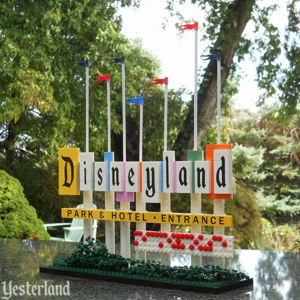
Photo by Andy Baird, 2016 |
|||
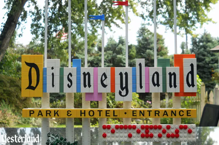
Photo by Andy Baird, 2016 |
|||
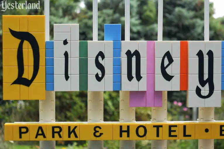
Photo by Andy Baird, 2016 |
|||
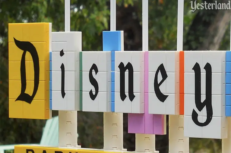
Photo by Andy Baird, 2016 |
|||
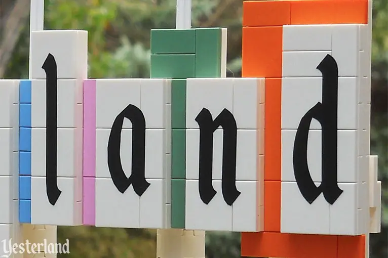
Photo by Andy Baird, 2016 |
|||
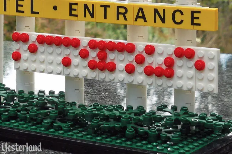
Photo by Andy Baird, 2016 |
|||
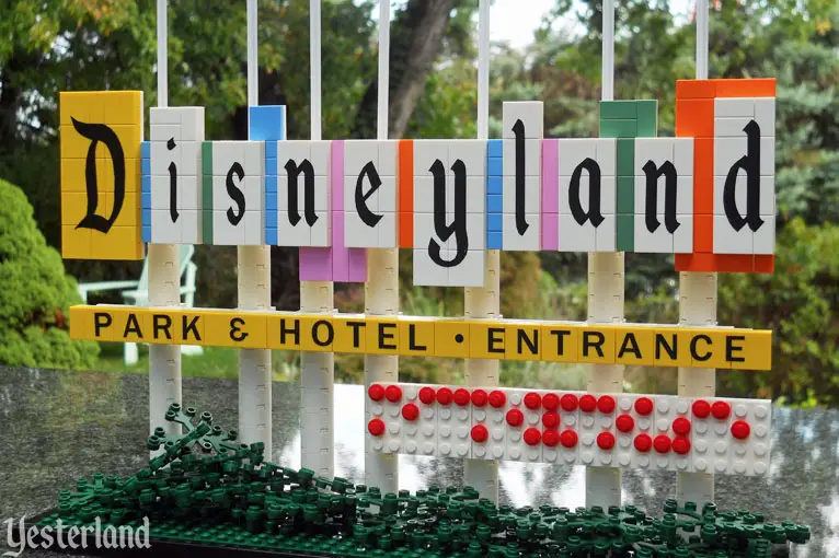
Photo by Andy Baird, 2016 |
|||
|
Yesterland has more about the Harbor Blvd. Disneyland sign, including how it has made a comeback at the Disneyland Hotel: |
|||
|
|
Click here to post comments at MiceChat about this article.
© 2016-2018 Werner Weiss — Disclaimers, Copyright, and Trademarks Updated July 6, 2018. |
||