A Photo Essay at


Yesterland.com
|
Walt Disney World Then and Now
Magic Kingdom

Part 2: Main Street, U.S.A. and Fantasyland
|

|
|
Two weeks ago, I published photos comparing Liberty Square, Frontierland, and Adventureland in 1983 and 2011.
Here’s part 2, with Main Street, U.S.A. and Fantasyland.
 , Curator of Yesterland, March 11, 2011 , Curator of Yesterland, March 11, 2011
|

|

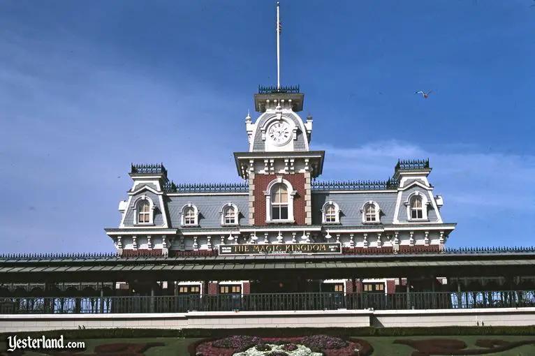
Main Street Station (1983)
|

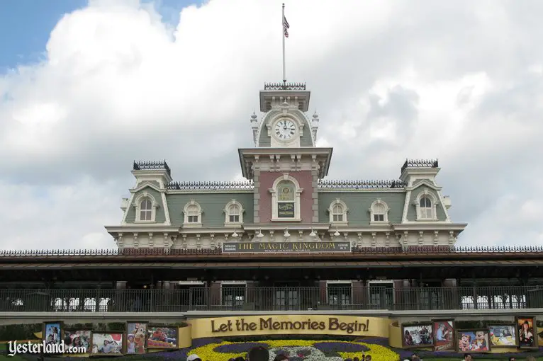
Main Street Station (2011)
|
|
Main Street Station not only serves as the primary starting point for Walt Disney World Railroad passengers; it’s also the iconic “front door” of the Magic Kingdom.
With its Mickey Mouse flower bed facing the entrance gates, Main Street Station is a popular photo backdrop for guests arriving at the Magic Kingdom.
- The exterior of Main Street Station is essentially unchanged since Walt Disney World opened in 1971.
- Holiday decorations and seasonal flower bed plantings are a long tradition.
- In the 2011 photo, the huge, temporary ribbon-shaped sign—with the advertising slogan “Let the Memories Begin!” flanked by giant photo frames—detracts from the careful turn-of-the-20th-century design of Main Street Station and how it introduces Main Street, U.S.A.
|

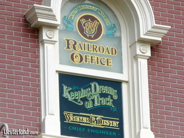
Walt Disney window (2011)
|
- The other major change to Main Street Station in the 2011 photo is the Walter E. Disney window on the central tower, a fitting tribute the railroad buff without whom there would not have been a Disneyland or Magic Kingdom.
|

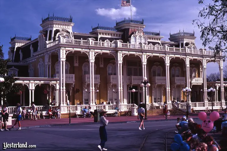
Hospitality House (1983)
|

Exposition Hall (2011)
|
|
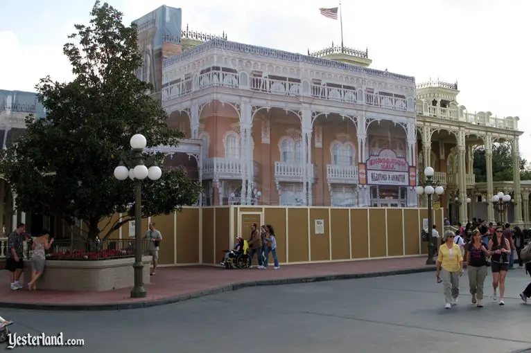
The ornate structure on the east side of Town Square opened in 1971 as the Hospitality House, presented by Gulf Oil Corporation.
It hosted The Walt Disney Story from April 1973 through October 1992.
For most of the past two decades, it’s been Exposition Hall, home to the Kodak Camera Center, historical camera displays, photo backdrops, and a small theater area showing Disney animation.
- At the time of the 1983 photo, there was no marquee across the front of the building.
- The lack of such a marquee is an example of how attraction signage was usually much more subtle in earlier decades than now.
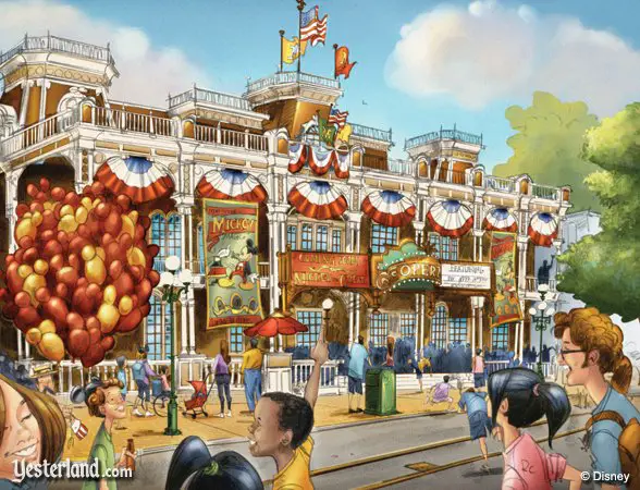
- In the 2011 photo, the former Hospitality House is in the process of being transformed into the Town Square Theater, the new meet-and-greet location for Mickey Mouse.
|

Town Square Theater
|
- If the Town Square Theater ends up look like the rendering, there will be nothing subtle about it.
|

Main Street, U.S.A. (1983)
|

Main Street, U.S.A. (2011)
|
|
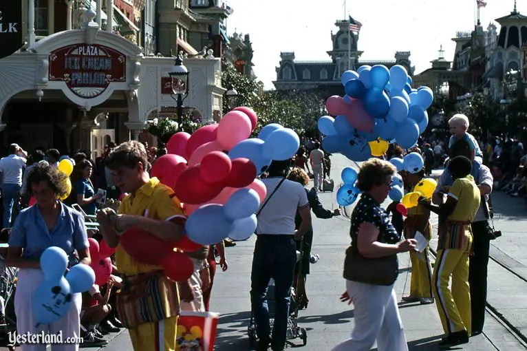
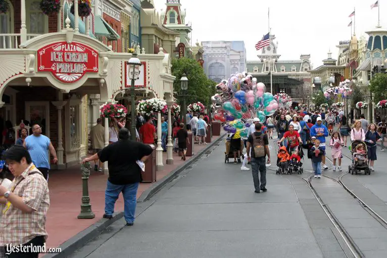
The Plaza Ice Cream Parlor and the balloon vendors were there in 1983 and 2011.
- Take a look at the bright yellow polyester costumes of the balloon vendors in 1983.
- The balloons in 1983 were simple Mickey Mouse head latex balloons, in bright colors.
- The balloons in 2011 are shiny mylar balloons or Mickey Mouse head balloons inside clear balloons.
|

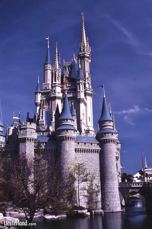
Cinderella Castle (1983)
|

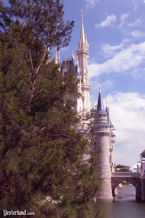
Cinderella Castle (2011)
|
|
Compared to 77-foot-tall Sleeping Beauty Castle at Disneyland, Cinderella Castle at the Magic Kingdom is enormous.
Its height is 185 feet or 189 feet or 190 feet, depending on which description you want to believe.
The trees around it have grown taller, changing the sense of scale.
- Cinderella Castle doesn’t look quite as enormous as it used to because the trees around it have grown.
- No, the big tree in the 2011 photo is not as tall as the castle; it’s just the angle of the camera that makes it look that way.
|

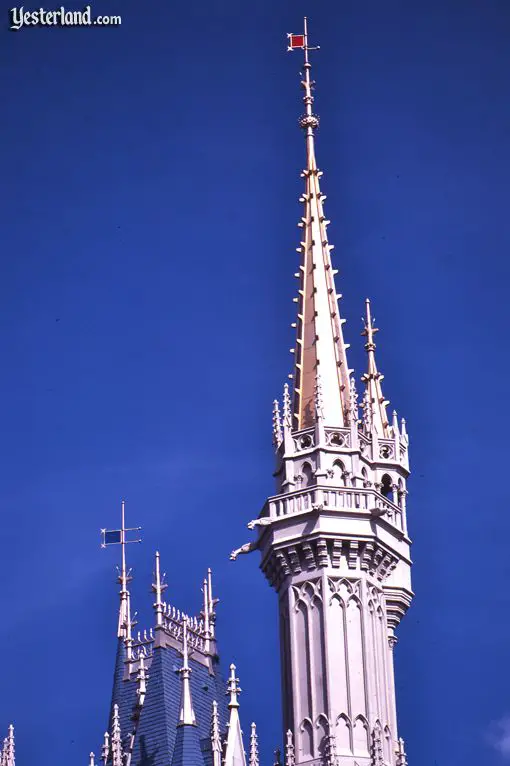
Spire on Cinderella Castle (1983)
|

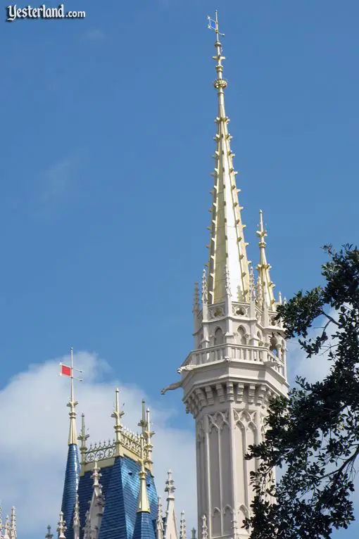
Spire on Cinderella Castle (2011)
|
|
In addition to being taller than Sleeping Beauty Castle, Cinderella Castle is also more ornate.
- The color of the wind flag has changed.
- The blue roof now has a zig-zag pattern, based on the original Herb Ryman concept art for the Castle.
- Overall, the Castle uses warmer hues.
- Some of the difference in color between the 1983 photo and the 2011 photo are due using film in 1983 and a digital camera in 2011.
|

“it’s a small world” (1983)
|

“it’s a small world” (2011)
|
|
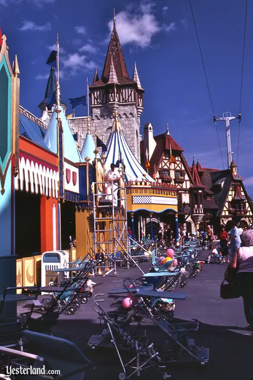
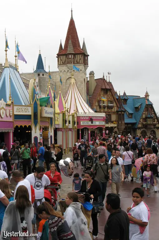
- The color palette of the exterior of “it’s a small world” in the two photos is noticeably different.
- The 1983 photo includes the cables and a support tower of the Skyway, but the attraction wasn’t operating on the day this photo was taken.
- The reason you don’t see parked strollers in the 2011 photos is that the stroller parking area is now at the base of the former Skyway station nearby.
- The guest entrance to “it’s a small world” has moved.
|
|
Would you like to see more photo essays like this one?
|
|
|
© 2011-2016 Werner Weiss — Disclaimers, Copyright, and Trademarks
Updated March 11, 2016.
Photographs of the Magic Kingdom in 1983: Werner Weiss and Dennis Derr, January 1983.
Photographs of the Magic Kingdom in 2011: Werner Weiss, February 2011.
Rendering of Main Street Theater © Disney.
|
