|
|
“it’s a small world” Times Six |
||
|
|
|||
|
The monumental façade of “it’s a small world” has been a beloved Disneyland landmark for more than a half century. After premiering as one of Walt Disney’s hit attractions at the 1964-65 New York World’s Fair, the original edition of “the happiest cruise that ever sailed ‘round the world” moved to Disneyland in 1966. As Disney built its next three “castle parks,” each included its own “it’s a small world” as an opening day attraction: Magic Kingdom Park at Walt Disney World (1971), Tokyo Disneyland (1983), and Disneyland Paris (1992). In 2008, Hong Kong Disneyland (2005) added “it’s a small world”. Shanghai Disneyland still lacks the classic ride. Today, Yesterland looks at each of the six “it’s a small world” exteriors.
|
|||
|
|
|||
|
New York World’s Fair |
|||
|
Although the six “it’s a small world” façades in this article are all different, five of them share a family resemblance—but “one of these things is not like the others.” At the 1964-65 New York World’s Fair, the ride was housed in an L-shaped metal shed with commercial signs touting its sponsor (Pepsi-Cola), its creator (Walt Disney), its name (“it’s a small world”), and the organization being saluted (UNICEF). So many different fonts! There was more than just the L-shaped box. Imagineer Rolly Crump designed a kinetic sculpture with playful whirligigs—the Tower of the Four Winds. It looked great as a model. Crump was appalled when be saw the full 120-foot-tall version. The contractor had engineered the tower to withstand strong winds, robbing it of its delicacy from Crump’s perspective. Most pavilions, especially corporate pavilions, were free to anyone who paid the gate admission to the World’s Fair—$2 for adults and $1 for childen in 1964. But “it’s a small world” was an exception. It cost 95 cents for adults and 65 cents for children under 12 both years—a hefty fee in 1964 for a 12-minute ride. Ten million people paid and rode. |
|||
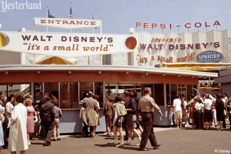
Disney Parks photo © 1964 Disney Ticket booths and signs at the New York World’s Fair |
|||
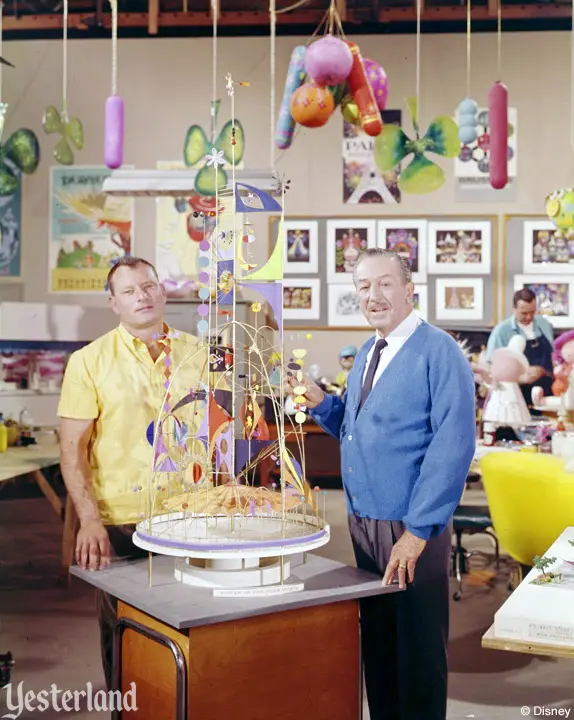
Disney Parks photo © 1964 Disney Rolly Crump and Walt Disney with a model of the Tower of the Four Winds |
|||
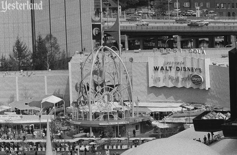
Photo by Paul Turner, 1964, under CC0 1.0 Universal Public Domain Dedication Tower of the Four Winds at the New York World’s Fair |
|||
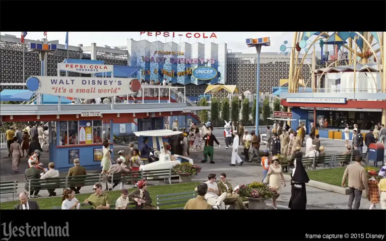
frame capture © 2015 Disney New York World’s Fair, as re-created in Brad Bird’s 2015 movie Tomorrowland |
|||
|
Disneyland |
|||
|
When the World’s Fair ended, “it’s a small world” was packed up and shipped to Disneyland—where it would be bigger and better. The trough for the boats, lengthened by a third, ran through a show building that was a third larger than in New York. The extra space allowed the addition of the South Pacific and the North Pole, as well as a more spacious presentation of the countries of Europe. But the biggest change was on the exterior. The Tower of the Four Winds did not make the trip to Disneyland. It was destroyed unceremoniously when the World’s Fair was over—and either sold as scrap metal or dumped into Flushing Bay, depending on which story you want to believe. For Disneyland, Rolly Crump drew inspiration from Imagineer Mary Blair, the key creative force behind “it’s a small world”. The entire façade became a work of art featuring worldwide landmarks, highlighted by a playful clock with a parade of dolls every 15 minutes. Over the years there have been changes to the color scheme, signage, sponsor, and the trees emerging from behind the façade. |
|||
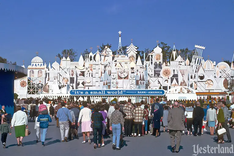
Photo by Charles R. Lympany, courtesy of Chris Taylor “it’s a small world” as it appeared during its first decade |
|||
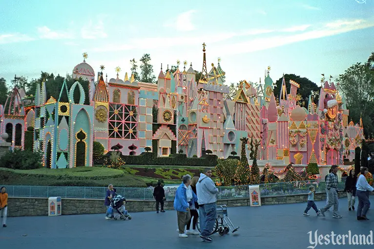
Photo by Werner Weiss, 1998 Lights for “it’s a small world” Holiday and pastel paint scheme |
|||
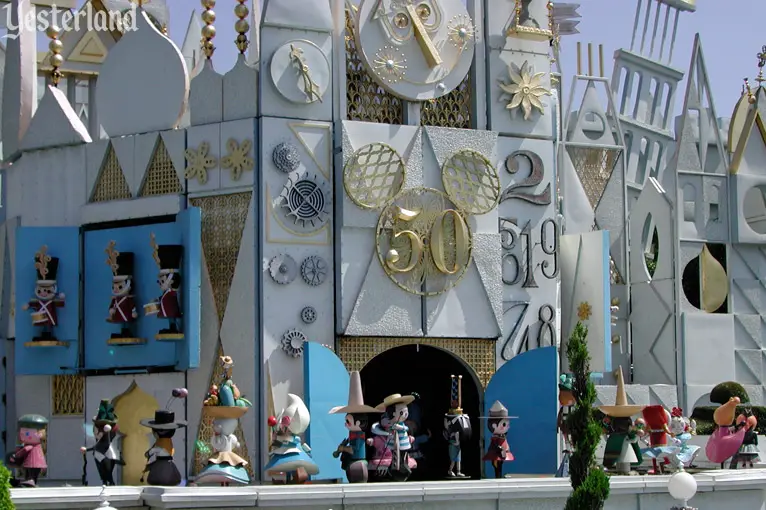
Photo by Werner Weiss, 2005 Return of original façade colors for Disneyland’s 50th anniversary, 2005 |
|||
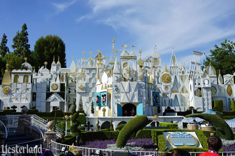
Photo by Werner Weiss, 2017 In recent years, looking much as it originally did |
|||
|
Magic Kingdom |
|||
|
Magic Kingdom Park would get an entirely new edition of “it’s a small world”. Its exterior featured the tournament style of other Fantasyland attractions at the park instead of a grand façade like the one at Disneyland—which made sense considering the ride was near the heart of Fantasyland, directly opposite Peter Pan Flight. Instead of an open-air load area, as at Disneyland, the Magic Kingdom version had an interior load area. Considering the tropical heat and frequent thunderstorms of Central Florida, that too made sense. Unfortunately, the results paled in comparison to Disneyland. But it improved over time. On March 18, 2005, “it’s a small world” at Magic Kingdom Park reopened after an almost year-long renovation. The exterior signage and the back wall of the load area were “Disneylandified” to the extent it was possible within the confined space. There’s a scaled-down clock tower, but no parade of dolls. |
|||
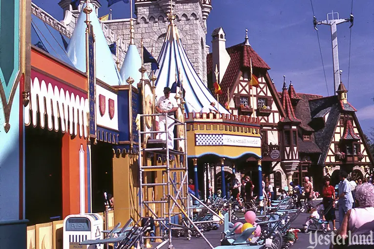
Photo by Werner Weiss, 1983 “it’s a small world” exterior at Magic Kingdom Park, as it looked in 1983 |
|||
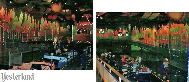
Photos by Allen Huffman, 1996, used with permission “it’s a small world” load area at Magic Kingdom Park, as it looked in 1996 |
|||
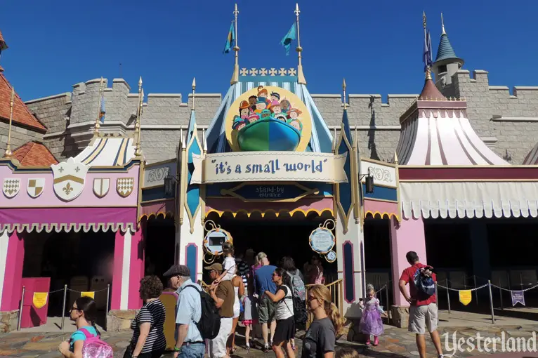
Photo by Werner Weiss, 2013 “it’s a small world” at Magic Kingdom Park as it now looks |
|||
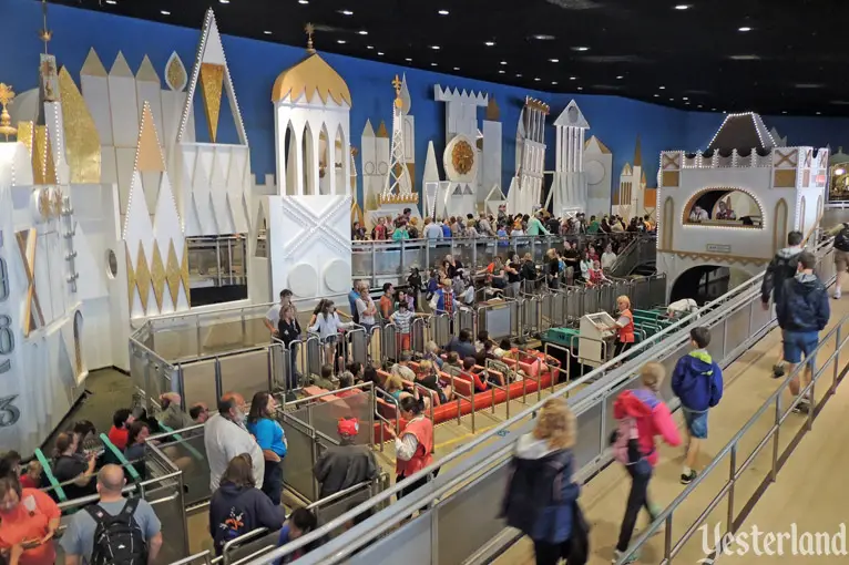
Photo by Werner Weiss, 2015 “it’s a small world” load area at Magic Kingdom Park, now mimicking Disneyland |
|||
|
Tokyo Disneyland |
|||
|
For Tokyo Disneyland, the Imagineers combined a grand façade, similar to the one at the original Disneyland—complete with the central clock and parade of dolls—with an interior load area. Instead of relying on white and gold, the façade used a pastel palette. It worked well, and it set the stage for the next two versions. |
|||
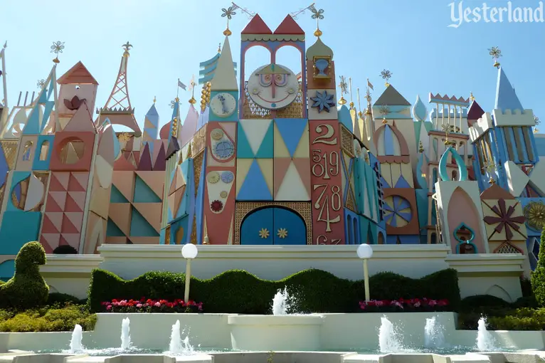
Photo by Rob Young, 2013, via Wikimedia Commons, under (CC BY 2.0) (modified) “it’s a small world” façade at Tokyo Disneyland |
|||
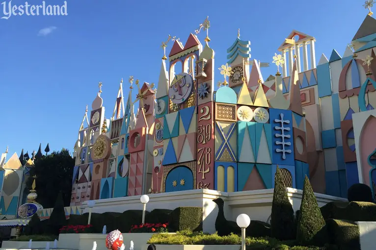
Photo by Eric Lynxwiler, 2015, used with permission “it’s a small world” color palette at Tokyo Disneyland |
|||
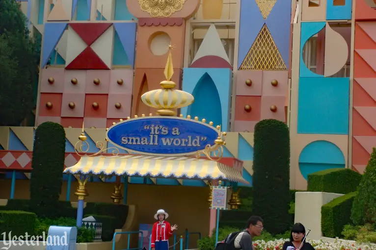
Photo by Martin Lewison, via Flickr, under (CC BY 2.0) (modified) “it’s a small world” entrance at Tokyo Disneyland |
|||
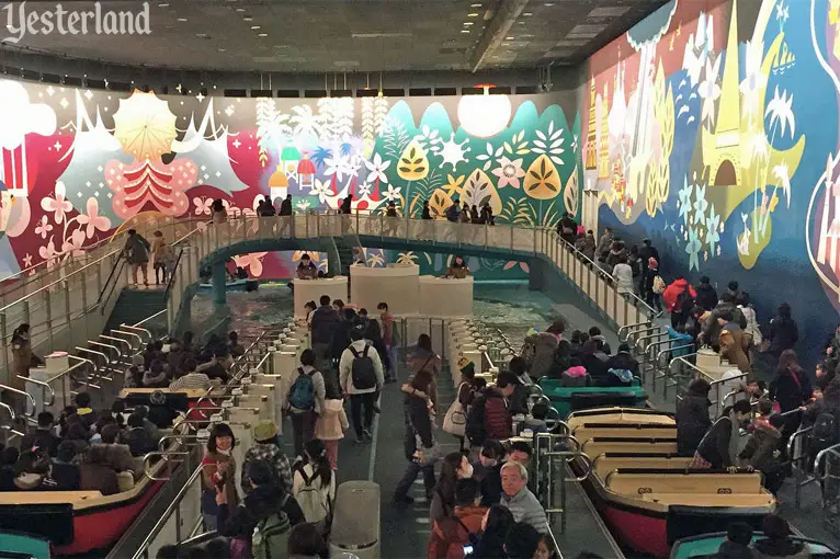
Photo by Eric Lynxwiler, 2015, used with permission Wrap-around mural in the load area of “it’s a small world” at Tokyo Disneyland |
|||
|
Disneyland Paris |
|||
|
Disneyland Paris also opened with a pastel version of “it’s a small world”, complete with a central clock and a parade of dolls. Although there’s still a distinct family resemblance, the style and details departed from what Rolly Crump had designed for Disneyland—especially the clock structure. The Paris version has outdoor loading, but uses canopies to protect guests from weather that can be less than Anaheim-perfect. |
|||
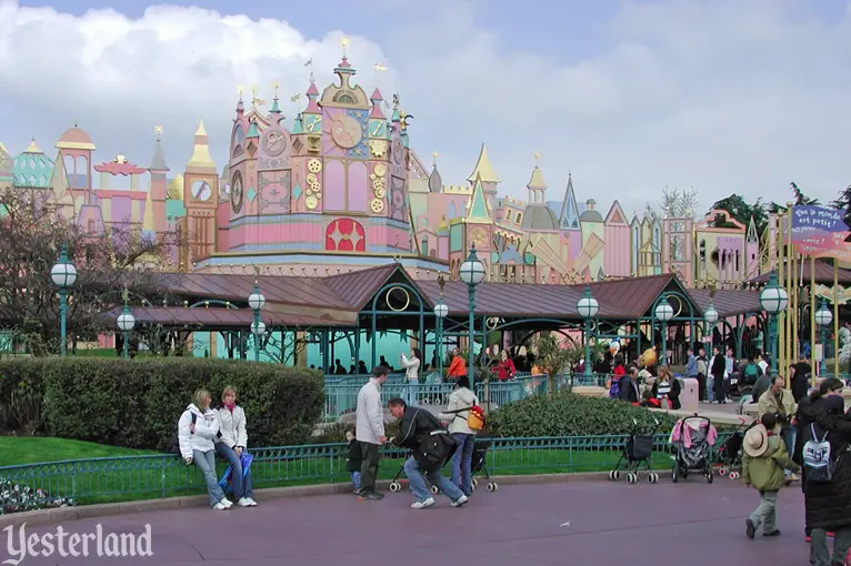
Photo by Werner Weiss, 2005 “it’s a small world” at Disneyland Paris |
|||
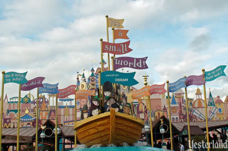
Photo by Chris Bales, 2017, used with permission “que le monde est petit” to “es ist eine kleine Welt” at Disneyland Paris |
|||
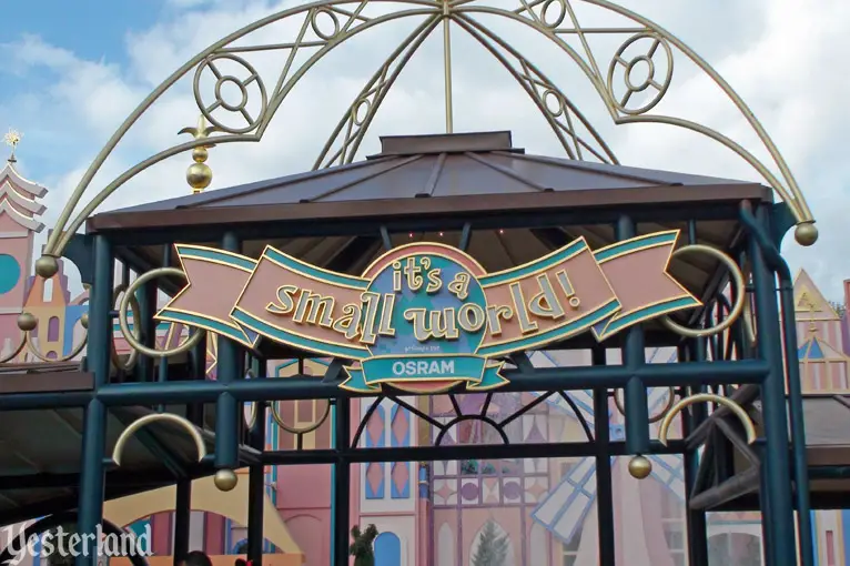
Photo by Chris Bales, 2017, used with permission Canopies at Disneyland Paris |
|||
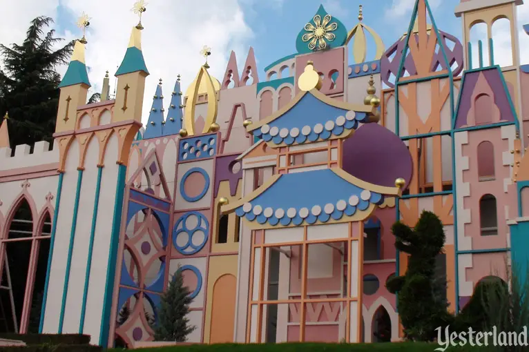
Photo by Chris Bales, 2017, used with permission “it’s a small world” at Disneyland Paris |
|||
|
Hong Kong Disneyland |
|||
|
The newest “it’s a small world” opened 44 years after the New York original—a testament to the timelessness of the original concept. It looks especially good from a distance, with the railroad underpass leading to it and the Lantau Mountains in the distance. Up close, it’s not as good. The façade sits on a clunky base that tries to mimic the style of the façade, but is out-of-scale. (Compare it to the base at Tokyo Disneyland.) When will Shanghai Disneyland get “it’s a small world”? |
|||
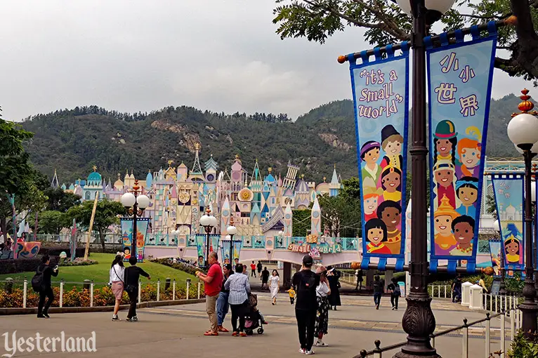
Photo by Werner Weiss, 2019 “it’s a small world” with the Lantau Mountains at Hong Kong Disneyland |
|||
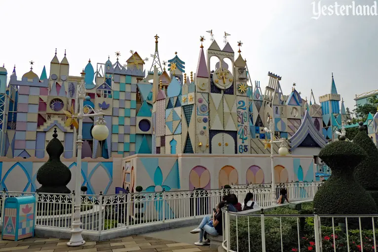
Photo by Werner Weiss, 2019 “it’s a small world” at Hong Kong Disneyland, sitting on boxy base. |
|||
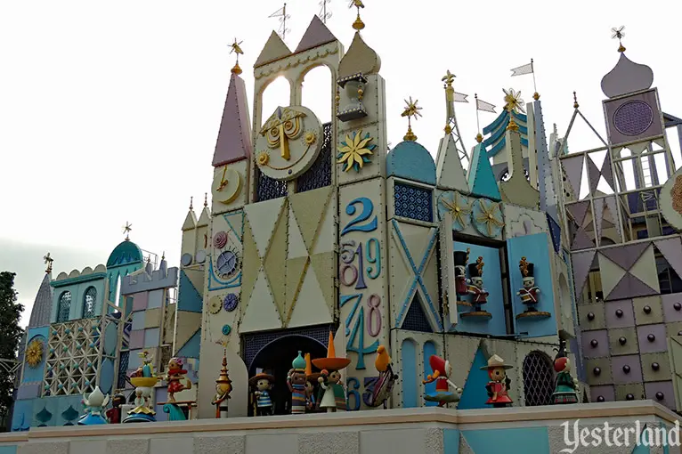
Photo by Werner Weiss, 2019 Parade of Dolls at Hong Kong Disneyland |
|||
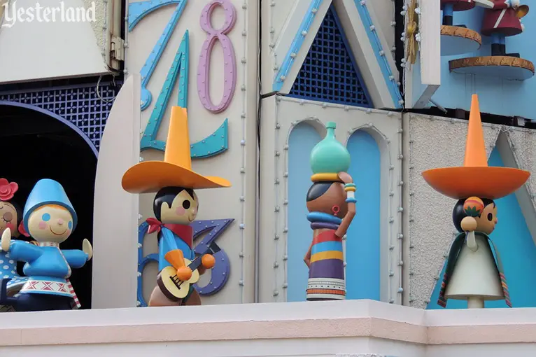
Photo by Werner Weiss, 2019 A closer look at the Parade of Dolls |
|||
|
|
Which version of “it’s a small world” do you like best? Click here to post your thoughts at MiceChat. Or share this article with your friends on Facebook.
© 2024 Werner Weiss — Disclaimers, Copyright, and Trademarks Updated November 15, 2024 |
||