|
|||
|
Originally, it was the Hollywood Pictures Backlot at Disney’s California Adventure. Now it’s Hollywood Land at Disney California Adventure. This is part 6 of Yesterland’s DCA “then and now” series comparing the same spots in 2002 and 2013.
|
|||
|
|
|||
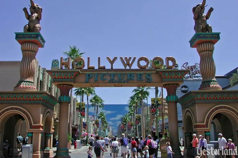
Photo by Werner Weiss, 2002 Looking down Hollywood Blvd. (2002) |
|||
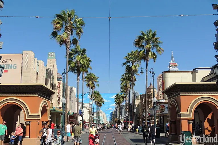
Photo by Werner Weiss, 2013 Looking down Hollywood Blvd. (2013) |
|||
|
Here’s the lead paragraph from a 2001 grand opening press release describing the Hollywood Pictures Backlot: The heyday of Hollywood comes alive at DISNEY’S CALIFORNIA ADVENTURE park. Enter the glamorous Hollywood Pictures Backlot through a massive gate inspired by the movie spectacles of Hollywood’s golden age. Walk along an idealized Hollywood Boulevard set designed in classic forties art deco style. See celebrity look-alikes along the thoroughfare while limousines park curbside waiting to whisk the latest Hollywood star off to the set. Amid soundstages and klieg lights, it’s all glitter and glitz in this district that takes a tongue-in-cheek view of the motion picture industry in California’s most well known city, Hollywood. Did you catch that it was supposed to be “an idealized Hollywood Boulevard set,” not an idealized representation of an actual boulevard? Despite the painted sky backdrop and the empty façades, the street failed to be convincing as a movie backlot set. Fast forward to 2013. Some of the most egregious visual contradictions have been removed. The pretense of being a movie backlot is gone, along with the Hollywood Pictures Backlot name and portal. It’s now essentially a 1930s-era continuation of the brilliantly executed 1920s-era Buena Vista Street. Red Car trolleys firmly establish it as a city street, not as a movie set. Unfortunately, the remaining shortcomings of the street now really stick out, especially when compared to Buena Vista Street. The “backlot” features of the street now just look cheap and unfinished. |
|||
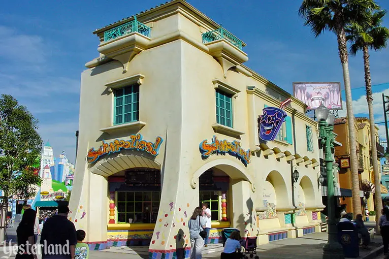
Photo by Allen Huffman, 2002 Schmoozies! fruit smoothie stand (2002) |
|||
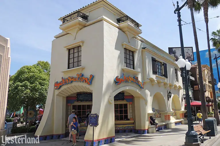
Photo by Werner Weiss, 2013 Schmoozies! fruit smoothie stand (2013) |
|||
|
In 2002, Schmoozies! had fruit painted on its columns and a protruding sign featuring a neon drink cup “face” with stars as eyes. The main neon signs had inappropriate lettering for the historical period of the building. Freeform mosaics using tile fragments were apparently meant to dress up the building, but they only detracted from its effectiveness as period architecture or as a believable movie backlot set. in 2013, Schmoozies! looked better. The obnoxious neon drink cup and the weird painted fruit are gone. The paint on the window frames, shutters, and balcony railings is more subtle. Now, Disney just needs to replace the main signs with ones that suggest the 1930s, not the 1990s. Then we could overlook the purple, blue, and black tiles around the base of the building. |
|||
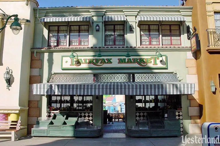
Photo by Allen Huffman, 2002 Fairfax Market (2002) |
|||
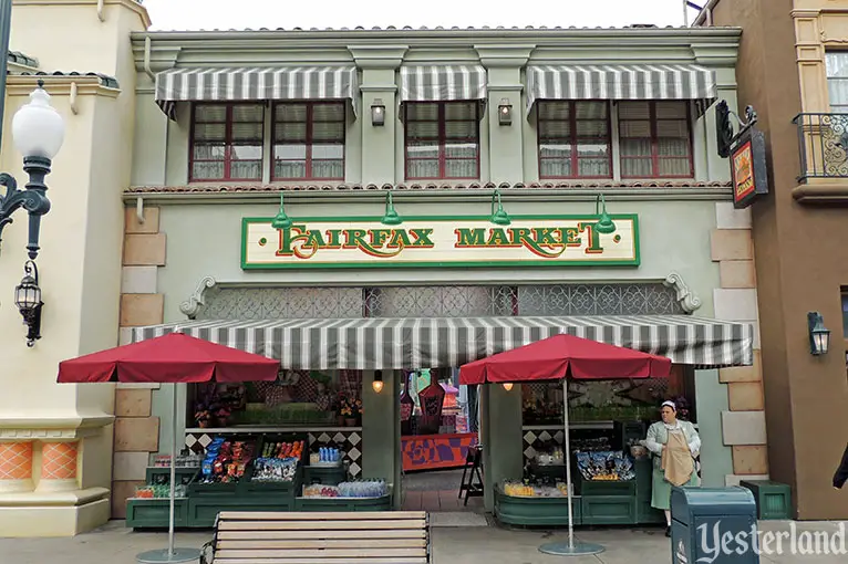
Photo by Werner Weiss, 2013 Fairfax Market (2013) |
|||
|
Fairfax Market is an example of “it’s just a movie façade.” The façade itself is nicely detailed and is probably based on a real building somewhere, but the actual inspiration remains a mystery for now. In the 2002 photo, the doorway provides a glimpse of SuperStar Limo. The 2013 photo shows Mad T Party behind the door. The market is selling snack foods out front in the newer photo, compared to having sad, empty fixtures in the older one. However, the red shade umbrellas are out-of place. If more shade is needed, perhaps the striped awning could be enlarged. Let’s hope that there’s eventually a budget to turn the Fairfax market into a real 1930s-themed food store. |
|||
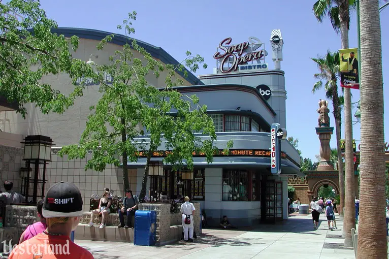
Photo by Werner Weiss, 2002 ABC Soap Opera Bistro (2002) |
|||
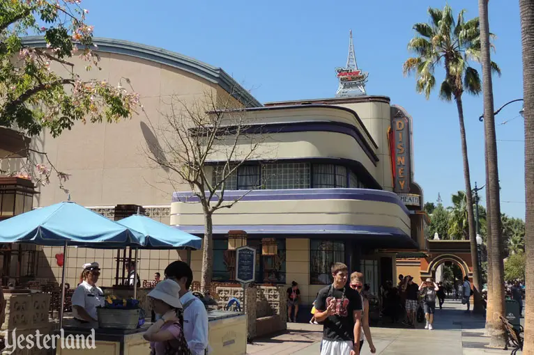
Photo by Werner Weiss, 2013 Disney Theater for Disney Junior - Live on Stage (2013) |
|||
|
The ABC Soap Opera Bistro must have seemed like a good idea—synergy with ABC, a fun restaurant experience for guests, and an opportunity to charge premium prices for that experience. But it didn’t last long. The new park had too many places to eat and too few attractions for young children. In 2003, a musical revue—Playhouse Disney - Live on Stage!—took over the space. Not shown in the photos above is the gaudy, out-of-place Playhouse Disney sign. It’s now Disney Junior - Live on Stage, with signage that’s more period-appropriate. |
|||
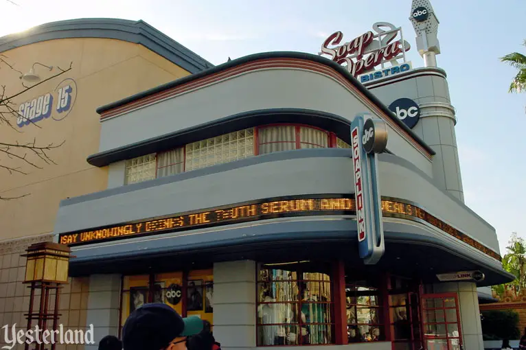
Photo by Allen Huffman, 2002 A closer look at Soap Opera Bistro (2002) |
|||
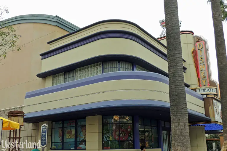
Photo by Werner Weiss, 2013 A closer look at the Disney Theater for Disney Junior - Live on Stage (2013) |
|||
|
Comparing the two pairs of photos, the most obvious differences between 2002 and 2013 are the colors and the signs. But a closer look shows the front of the building has become taller. Essentially, there’s another layer on the “cake.” Presumably this is a barrier to protect workers on the roof, without resorting to an ugly railing. Unfortunately, the change to the building’s proportions is awkward. |
|||
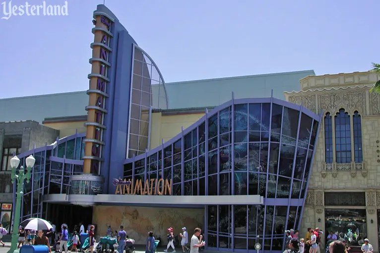
Photo by Werner Weiss, 2002 Disney Animation (2002) |
|||
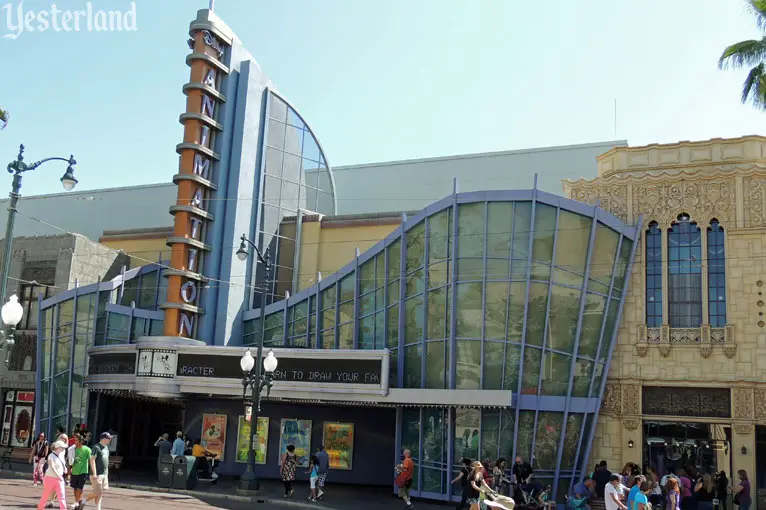
Photo by Werner Weiss, 2013 Disney Animation (2013) |
|||
|
While the rest of Hollywood Blvd. relies on artful façades that would have been around during the Golden Age of Hollywood, the façade of the Disney Animation attraction is a 1990s Postmodern interpretation of Streamline Moderne. It’s jarringly out-of-place and even spills over onto the Churrigueresque Off the Page store next door. Only the front of the vertical sign tower could reasonably pass for Streamline Moderne of the 1930s. Compounding the problem, the big box of the Disney Animation show building is in plain sight, with no effort to hide it or dress up the box. That’s how it was when the park opened in 2001, and it’s never been fixed. Undoubtedly, a skillful Imagineer could come up with a forced perspective solution to make it appear that taller buildings are on the next block. |
|||
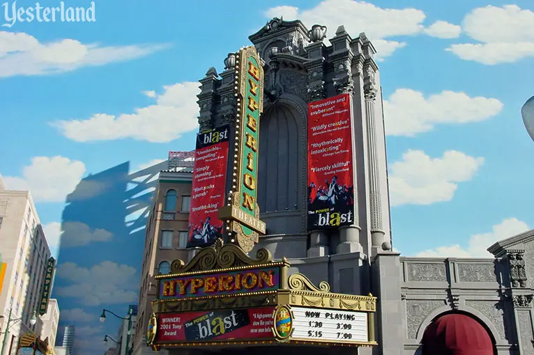
Photo by Allen Huffman, 2002 Hyperion Theater and blue sky backdrop (2002) |
|||
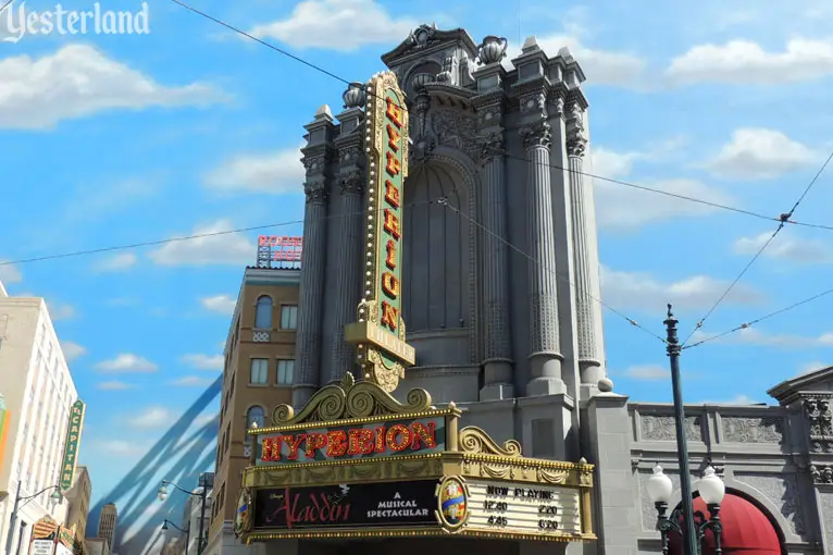
Photo by Werner Weiss, 2013 Hyperion Theater and blue sky backdrop (2013) |
|||
|
Instead of designing a traditional theater exterior, the original Imagineers of the Hyperion Theater (and the executives who controlled the pursestrings) decided on a big box building with a painted sky on one side and some false fronts tacked on, based on Los Angeles area landmarks. The blue sky backdrop had real-life counterparts in the real Hollywood. For example, Paramount Pictures had a huge painted sky at one edge of the Western town. Movie directors could always have a blue sky with perfect fluffy clouds if they framed their scenes carefully. (Paramount’s sky backdrop is still there, but the Western town is now a parking lot.) |
|||
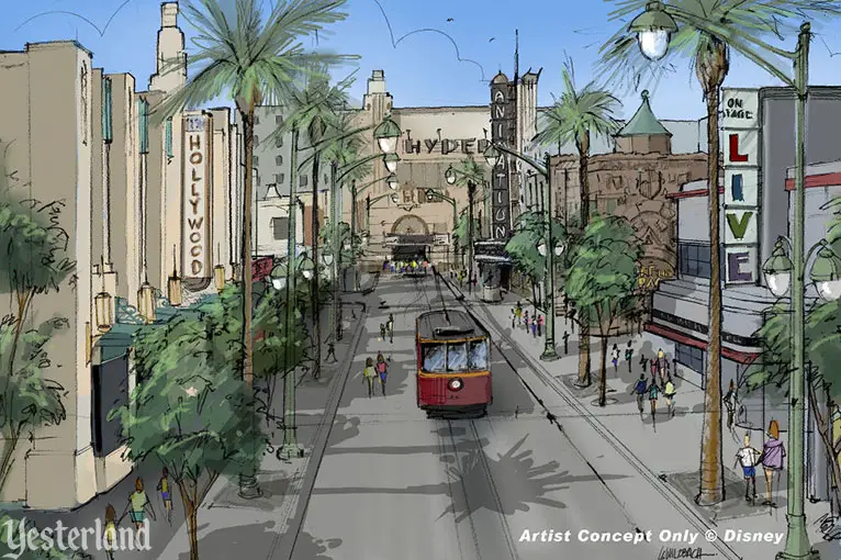
Artist Concept Only © Disney Disney concept art for an overhaul of Hollywood Blvd. (2007) |
|||
|
Hollywood Blvd. at Disney California Adventure’s Hollywood Land has improved in recent years, but it needs more attention. When the senior executives of Disney’s Parks & Resort business segment figure out the next budget, perhaps they should take a look at Imagineering concept art from 2007—with the Hyperion transformed into a fully-realized theater building, Disney Animation taking on the appearance of the famed Hollywood Pantages Theatre, and all remnants of backlot cheapness erased. Pinocchio wanted to be a real boy, and Hollywood Blvd. wants to be a real street—just like its neighbor, Buena Vista Street. |
|||
|
|
Click here to post comments at MiceChat about this article.
© 2014 Werner Weiss — Disclaimers, Copyright, and Trademarks Updated January 17, 2014. |
||
